Victorian Color Trends
To explore Victorian Color Trends with a focus on The Historical Context of Victorian Color Palette and Influencing Factors on Victorian Color Choices. Understanding the history of color choices and the cultural and societal factors that influenced these choices can help us better appreciate the beauty and significance of Victorian color trends.
The Historical Context of Victorian Color Palette
Victorian color palettes were impacted by multiple factors. Technological advances, like the development of aniline dyes, enabled manufacturers to create a wider range of colors at lower costs. Then, societal factors like mourning customs and the role of women drove color selection. For instance, black was a popular choice for mourning and pastel shades were often used by women to demonstrate modesty and femininity.
Moreover, Queen Victoria’s affinity for dark shades of green and purple also made them popular during this era. Today, you can recreate the Victorian style by incorporating deep jewel tones like garnet red or emerald green into your décor. This will give your space a luxurious yet timeless feel that pays homage to this historical period.
Influencing Factors on Victorian Color Choices
In the Victorian era, societal norms, cultural practices, and artistic movements all influenced the way people chose colors. This is seen in fashion, home decor, and other aspects of life. A table can be used to show what shaped Victorian color trends.
| Factors influencing Victorian color trends | Examples |
|---|---|
| Economics | Access to rare dyes and materials |
| Social Class | Each class had their own preferred shades |
| Gender Roles | Women typically wore pastels or light colors, while men donned darker clothing |
| Artistic Movements | Emphasis on bold jewel tones and gaudy floral prints |
| Literature | Colors could represent social status and convey moral messages |
| Beliefs | Colors could positively affect mood or health |
Queen Victoria’s 1840 white wedding dress was a huge trend and emphasized how powerful figures can shape fashion trends related to colors. Bold jewel tones and gaudy floral prints were popular – far from minimalistic!
Popular Victorian Color Schemes
To discover popular Victorian color schemes, turn to this section. With a focus on traditional and modern interpretations of Victorian colors, you can gain insight into how to incorporate this striking color palette into your own home décor. Delve into the nuanced sub-sections of traditional Victorian color schemes and modern interpretations for a comprehensive look at Victorian aesthetics.
Traditional Victorian Color Schemes
The color schemes of the Victorian era are key in design and architecture. They symbolize the grandeur, sophistication, and charm of that time. Darker shades like forest green, navy blue, and deep reds were popular. Plus, intricate patterns like damask and floral prints adorned wallpaper and furniture.
Bringing in Victorian colors with a modern touch? It’s like a hipster wearing a top hat! Capture the timeless beauty of historic designs. Burgundy and gold give a luxurious, dramatic look – perfect for formal living areas. Emerald green and mahogany bring a classy vibe to study rooms or libraries. Navy blue and cream bring tranquility to interior spaces.
Modern Interpretations of Victorian Colors
The Table shows modern interpretations of popular Victorian color schemes used in interior design. For instance, Art Nouveau-inspired turquoise and yellow-green paired with dark teal from the Gothic Revival era. Plus, Rococo pastels making the rounds in home decor.
Unconventional tones such as dusty pink, muted mauves, and deep blues give a unique twist.
Interestingly, working-class homes during the Victorian era often used neutral colors due to cost.
Designers are blending traditional palettes with contemporary preferences. This creates unique feelings through color schemes.
Take your guests back in time with these Victorian color schemes. Just don’t forget to bring them back to the present too!
Applying Victorian Colors in Interior Design
To apply Victorian colors in your interior design with the right aesthetic, check out this section on how to choose colors that fit the Victorian era. You’ll be able to achieve this by understanding Victorian color combinations for walls and ceilings, along with using accent colors and decorative elements in Victorian interiors.
Victorian Color Combinations for Walls and Ceilings
Create an inviting, classic aesthetic in your home with Victorian era colors! Here are some unique combinations for walls and ceilings that will blend a sense of the past with a modern feel.
| Color Combination | Description |
|---|---|
| Deep Jewel Tones | Pair emerald green or sapphire blue with burgundy or gold to add depth and richness. |
| Pastel Shades | Create a soft, romantic atmosphere with blush pink, lavender, and powder blue. |
| Monochromatic Schemes | Layer lighter peach tones with deeper rust hues to create depth. |
Consider wallpaper borders or ornate moldings in contrasting hues for a finishing touch. Brands like Farrow & Ball or Sherwin-Williams have period-specific paint colors. Customize your own unique look!
Bring history to life in your home by applying these colors to your walls and ceilings. Add a touch of luxuriousness with accent colors and decorative elements that make a statement!
Accent Colors and Decorative Elements in Victorian Interiors
Victorian interiors are known for their use of deep, rich colors. Think emerald, ruby, and sapphire. Furniture, wallpaper, and textiles had intricate patterns and motifs to match the colors.
Moldings, carved woodwork, and stained glass windows added depth and character. Plus, they showed off craftsmanship of the time. Chandeliers and sconces gave light and made a statement.
Details matter too! Tassels on curtains, lace doilies on tabletops, and fringe on pillows can add a touch of Victoriana.
Queen Victoria’s love of colorful jewelry influenced her home decor. She wanted her surroundings to reflect her jewelry. John Fowler used gemstone colors in Buckingham Palace, and the trend spread throughout England.
So why go black? Try deep burgundy or emerald to add Victorian sophistication.
Using Victorian Colors in Fashion and Accessories
To bring a touch of elegance to your wardrobe, explore the timeless and sophisticated world of Victorian colors. With the help of this section on using Victorian colors in fashion and accessories, you can effortlessly incorporate hues from the era into your everyday style. Get inspired by the Victorian inspirations in contemporary fashion trends, or try accessorizing with Victorian colors and patterns to elevate your looks.
Victorian Inspirations in Contemporary Fashion Trends
Victorian fashion continues to inspire modern trends. Designers incorporate muted color tones and intricate detailing. Popular garments like corsets, high-necked blouses and tailored jackets have resurged. Choker necklaces with pearl drops and cameo pins depict Victorian charm. Velvet fabric with rich patterns and shades also recall the era.
Darker hues like bottle green, burgundy or deep purple are fashionable. These colors lend elegance when paired with modern styles. To embody a vintage flair, pair items with dark/earthy tones with sheer fabrics or laces. Reach back to a darker, more dramatic era with Victorian colors and patterns!
Accessorizing with Victorian Colors and Patterns
Incorporating Victorian colors and patterns into your fashion choices can bring a vintage elegance. Think about jewel tones like emerald green, ruby red, and sapphire blue – plus floral and ornate motifs.
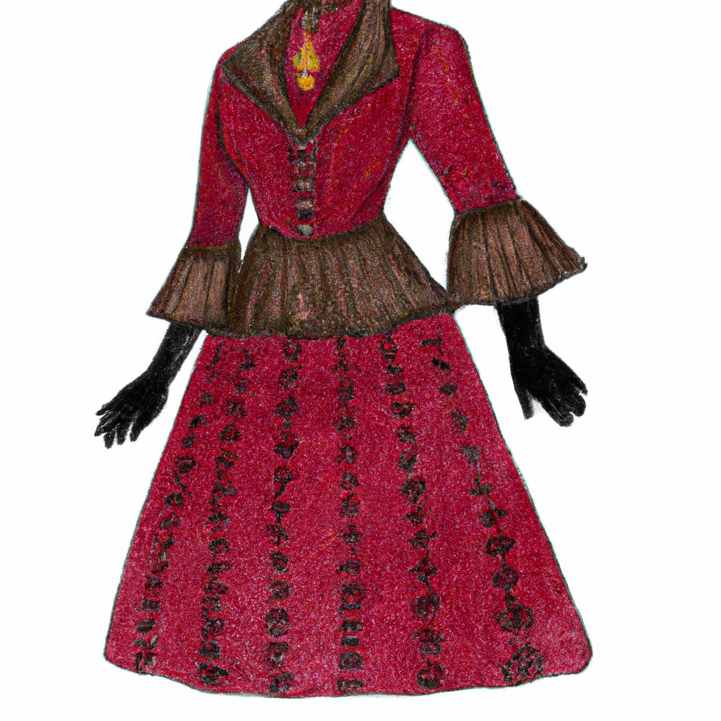
Accessorizing possibilities are plentiful! For example, pair a cream-colored blouse with a velvet emerald green choker. Or, add a ruby red silk dress with black leather gloves, featuring rose embroidery. Or, why not a navy blue wool coat with brass buttons, plus a floral brooch in shades of blue and white? And for boots, ivory lace-up with stacked heels, and a sapphire blue velvet handbag with silver accents.
Layering different textures and materials will further enhance the look. For example, a dark velvet blazer over a lacy blouse, or a fur stole to a satin evening gown. Alexander McQueen’s collection “The Widows of Culloden” is a great example of modernizing the timeless elegance of Victorian style.
Accessorizing with Victorian colors and patterns will make you feel like the sophisticated person you always knew you were. Incorporate them into your art and design projects to give them an extra special touch.
Victorian Colors in Graphic Design and Art
To explore Victorian colors in graphic design and art, you need to know the different approaches to use them. The best solution is to use Victorian color palettes for graphic design or modern artistic interpretations of Victorian colors.
Victorian Color Palettes for Graphic Design
The Victorian Era has left its mark on many art and design forms. Color palettes used in these designs can make a big difference.
If you want to create a Victorian-inspired design, use a table with columns like ‘Color Name‘, ‘Hex Code‘, and ‘Usage‘. For example, Dark Red (#8B0000) stands for power and wealth, while Pale Yellow (#FFFFE0) symbolizes harmony and elegance.
Muted or earthy hues over bright colors are more true to the Victorian style. Contrasting dark colors with gold accents also looks classy.
Pro tip: Don’t use too many bold colors. Choose a harmonious color gradation that matches the design’s theme for a chic Victorian look.
Modern Artistic Interpretations of Victorian Colors
The modern take on Victorian colors is bold yet minimalistic, creating an air of sophistication. Deep jewel tones like sapphire, emerald, and garnet, as well as metallic finishes, are being used to add depth. Plus, artists are adding soft pinks, blues, and grays to the classic color scheme.
Designers are increasingly choosing vintage themes for their projects. To give each project a unique identity, custom palettes using Victorian colors can be tailored to specific needs. They evoke nostalgia as well as subtlety.
Designers must stay on top of the latest trends. To do this, they must explore new methods and color schemes to add freshness and innovation to their work. Keeping up-to-date with color palettes is essential to infuse renewed energy into art today!
Conclusion: The Timeless Elegance of Victorian Colors.
Victorian colors boast timeless elegance. Rich and vibrant hues used in this era remain popular today. They evoke luxury and sophistication. Burgundy, emerald green and navy blue were common in furnishings, wallpaper and clothing. Cream, ivory and taupe tones featured too.
Plus, bold patterns were present in fabrics and wallpapers. Floral prints and geometric shapes like diamonds or stripes added depth and texture.
When bringing Victorian colors into modern décor, balance them with contemporary elements. Accentuate a statement piece with classic tones, keeping the rest of the room neutral. For a bolder approach, pair complementary colors on opposite sides of the color wheel.


