Overview of Victorian House Colors
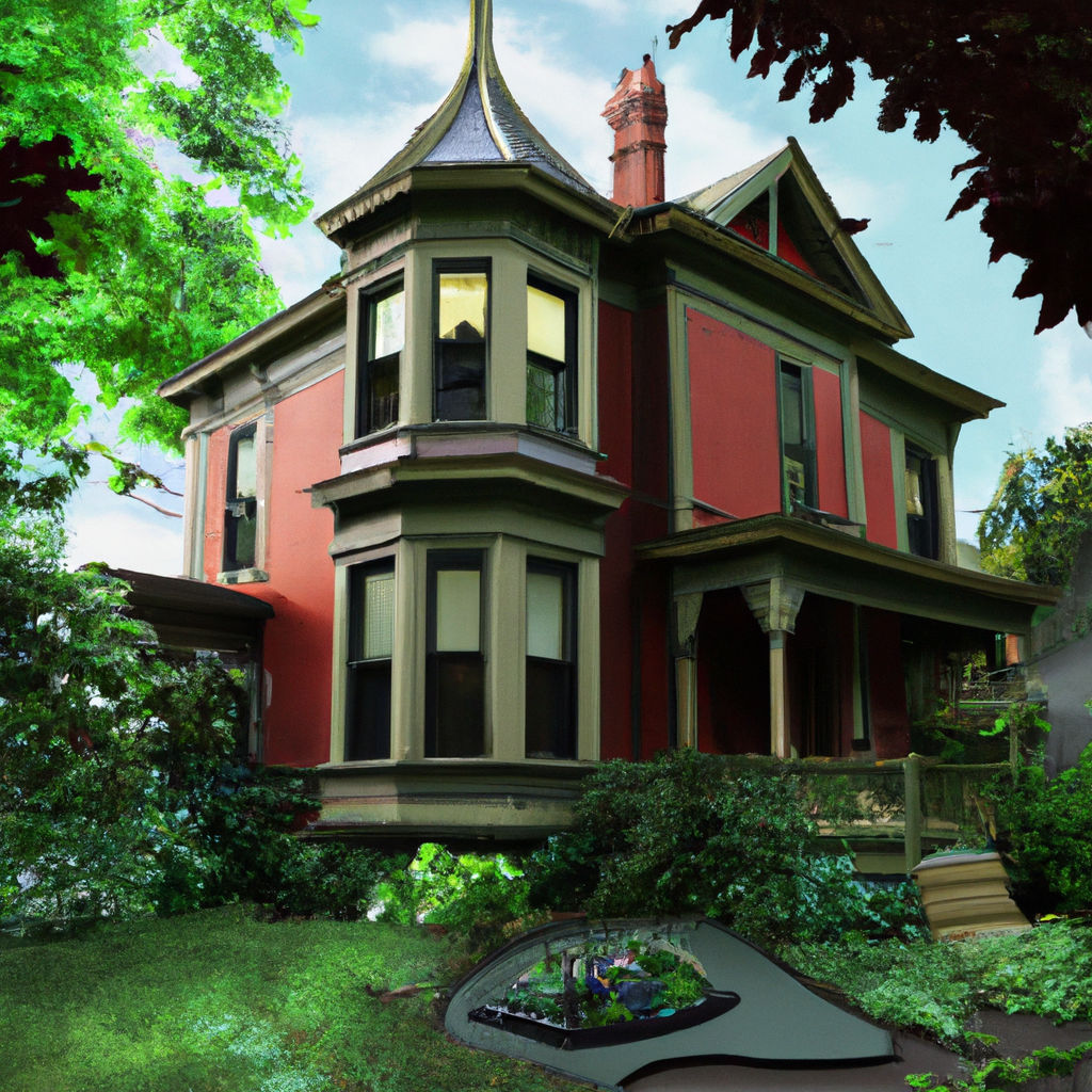
Victorian houses are renowned for their bright, bold hues and intricate details. Colors from the Queen Victoria era in the 19th century include reds, browns, greens, blues, and yellows. Most homeowners use bold color combos to show off delicate details such as scalloped shingles or ornate moldings.
Two to three different colors are used to emphasize exterior patterns. Whites or light beige generally cover trim, windowsills, etc. Meanwhile, doors and baseboards boast striking colors. Colors must complement the design to get a unified look.

Adding unique touches like hand-painted tile exteriors or vividly colored columns with corresponding trim overhangs can make a Victorian-style home even more unique.
If you are repainting a Victorian house, consider using contrasting hues for added charm. Make sure to stay true to historical accuracy when restoring it, yet still exhibit a fresh aesthetic that expresses individuality.
Finding the right hue for your Victorian exterior is like finding the perfect tinder date – it’s all about the right swatch.
Exterior Victorian House Colors
Victorian houses’ exteriors’ unique color palette evokes a sense of historic charm. Paint colors used on the outside of Victorian homes in the 19th century were vibrant variations of primary hues with rich tones for adding depth and detail.
Colors for a Victorian house should be inspired by the building’s ornamentation, such as prominent archways, bay windows, and cornices.
- Colors used for Victorian houses’ exteriors were often muted jewel tones or earthy shades like forest greens, deep brick reds, and grays accented by blacks.
- Contrasting colors for trims and gutters accentuate the exterior ornamentation and give it a more distinctive look.
- Victorian houses with cottages or shingles have more options in terms of color schemes, allowing for brighter hues and more playfulness.
- Choosing a color scheme that complements the home’s surrounding landscape adds to the overall aesthetic and coherence.
- Using complementary colors or monochromatic tones for the exterior walls and porch floors is more in line with traditional Victorian color schemes.
Victorian houses were constructed during different eras, and each era was influenced by color trends. The earlier the era, the brighter the colors used on the house’s exterior. However, as time passed, the colors became more subdued and somber.
A True Story
Carla’s house had been in her family for generations, and it was a Victorian-style house with an attractive paint scheme that included burgundy, cream, and forest green. They had recently received an offer on the house, but the potential buyers were insisting on repainting the house’s exterior in pastel shades of pink and blue to match their taste. Carla couldn’t bear the thought of her family’s home being stripped of its classic charm, and they ultimately decided not to sell the property.
Add a pop of personality to your classic Victorian with bold reds and yellows – just don’t blame us if the neighbors confuse your home for a circus tent.
Bold Reds and Yellows
Seek a Victorian house with a bold exterior? Try fiery reds and sunny yellows. These shades show confidence, energy, and playfulness. Pair them with neutrals like white and gray trims for a statement. Make a table of color combinations. Main exterior, accent, trim, and front door/shutter colors. Enhance the hues by using them on gables or spindles. Add patterned textiles and decorative tiles with reds and yellows. Bright pigments became trendy during the Victorian era due to dyeing and printing methods. Hence, vivid reds and yellows became fashionable for exteriors and interiors. Want to blend in with your garden? Opt for earthy greens and browns. But don’t be shocked when your house starts photosynthesizing!
| Main Exterior | Accent | Trim | Front door/shutter |
|---|---|---|---|
| Fiery red | Sunny yellow | White or gray | Black |
Earthy Greens and Browns
Earthly greens and browns can give your Victorian house exterior a warm, inviting feel. Sage green, olive, chocolate, and terracotta all blend in nicely with outdoor surroundings. Muted tones create an elegant, understated look. Go for unique shades like moss green and caramel brown. To enhance the rustic natural appearance, add a weathered wood texture. Contrast the hues with white trimmings and black shutters. Green and brown, plus neat trimmings, give your house a classic, yet contemporary look. Your home’s curb appeal will stand out from the rest. So why not give your Victorian house exterior a new lease of life? Pick earthy greens and browns – even Barbie’s Dreamhouse couldn’t pull off soft pastel pinks and blues like this!
Soft Pastel Pinks and Blues
Gentle blues and pinks, muted tones for Victorian house exteriors. These shades bring about a sense of relaxation, and a calming atmosphere. Pastel colours are perfect for Victorian-style exteriors, as they highlight the intricate design.
These soft hues of pink and blue make an ideal backdrop to the dark or neutral trim work. It creates a contrast with the ornate detailing that’s typical of Victorian architecture. And, not only do they look beautiful, but they also add to the resale value of homes.
Pastel pinks were often used inside traditional Victorian interiors, with olive greens and deep navy blues. The application of these colours to the outside of buildings adds a timeless beauty.
Sherwin Williams’ Colour of the Year – Naval – is a ‘rich navy, creating a grounding effect’. It goes well with pastel pink on exterior doors or shutters, giving your house a timeless elegance. Step inside and be transported to a world of bold wallpaper patterns and vivid colours.
Interior Victorian House Colors
In Victorian times, interior house colors were carefully chosen to create a sophisticated and elegant look. To achieve the desired aesthetic, specific colors were favored that captured the essence of the era.
Here are 5 points to help you understand the Interior Victorian House Colors:
- While modern homes are often painted white or beige, Victorians were partial to darker, richer colors. Dark reds, greens, blues, and purples were the preferred colors for interior walls.
- To complement the bold hues, the Victorians used intricate patterns, textures, and prints on their wallpaper and fabrics. Floral patterns, stripes, and damask designs were popular.
- To create a sense of warmth and coziness, woodwork and trim was painted in warm colors like burgundy and brown.
- For those who couldn’t afford expensive wallpaper or paint, decorative finishes like stenciling and marbling were used to add color and texture to their walls.
- The preferred colors changed over time; early Victorians favored brighter and bolder colors like emerald green and bright blue, while later Victorians preferred more muted colors like olive green and dusty rose.
In addition, it’s important to note that each room in a Victorian home had a specific color scheme that was carefully planned out to create a sense of continuity and flow throughout the house.
A true fact about Victorian house colors is that lead-based paint was commonly used during the era, which can be harmful if ingested. It’s important to take proper precautions when renovating or restoring a Victorian home. (Source: National Trust for Historic Preservation)
Paint your house red and green, and you’ll feel like you’re living in a perpetual Christmas village – minus the presents and holiday cheer.
Dark Rich Reds and Greens
Individual style preferences have always been important when choosing colors for the interior. The combination of ‘Deep Lush Reds and Verdant Greens’ brings to mind a cozy atmosphere with classical inspiration. This color scheme is perfect for Victorian-style homes.
- Walls can be painted in deep merlot red or forest green, giving the room an intimate, elegant vibe.
- A great feature wall idea is painting it with burgundy and beige, contrasting with ivory trim paint.
- For a cozier feeling, combine these shades with dark wood flooring, white lace curtains, and ornately carved furniture.
- To let the palette shine, use luxurious textiles such as velvet and silk curtains in jewel tones. These can be complemented with richly patterned upholstery.
- Lighting also has an impact; red tones make warm lighting while cool lighting can bring out greens creating a serene atmosphere.
Adding modern pieces to the traditional decor makes each room unique. To further emphasize this, consider painted ceilings or decorative wallpapers.
Don’t be afraid to use Deep Lush Reds and Verdant Greens in every aspect of your decor. Let these timeless colors turn lifeless rooms into warm havens with a sense of nostalgia, and indulge its inhabitants with classical afflatus. If you want a fancy Victorian-style ballroom in your home, these lavish interior colors are the way to go.
Lavish Golds and Silvers
The Victorian era was known for its lavish interior design, incorporating opulent shades of gold and silver. Gold leaf was a popular choice to add a touch of glamour. Antique silver created a vintage and elegant feel. Pale gold and champagne provided a sense of luxury.
These colors weren’t just limited to decorations. They featured heavily in furniture pieces like chandeliers and mirrors. Silver leaf was even applied directly onto walls to create a reflective surface.
Incorporating these lavish golds and silvers into interior design can evoke the elegance of that era. Using them on walls or as accents adds timeless charm and creates an inviting atmosphere.
For a calmer atmosphere, escape the stress of modern life with shades of blue and grey. Perfect for when you want to pretend phones don’t exist!
Soothing Blues and Greys
Blue and grey tones can make for a calming atmosphere in Victorian homes. These hues bring tranquility and sophistication. They give a room an understated elegance that doesn’t overwhelm the space.
Textures like velvet, linen, and wool create a timeless classic feel that’s perfect for Victorian spaces. Brass and copper accents add depth and accentuate the calming blues and greys.
When picking the right blue or grey for your Victorian home, it’s important to consider the lighting. This will show the true beauty of the colors.
One homeowner remodeled her home with shades of blue and grey. She was ecstatic with the result – her house became a peaceful haven that everyone admired.
To conclude, blues and greys are great for bringing out Victorian elements while keeping harmony in the rooms. These earthy hues create a soothing environment that you’ll love. Accents and trims are like the sidekick in a superhero movie – they steal the show!
Accents and Trims
In Victorian architecture, Unique Trim and Accents played a significant role in enhancing the overall aesthetic appeal of a house. Here’s how to incorporate them in your home decor:
- Choose a contrasting color for your door trim that complements the primary color of your house.
- Use decorative brackets, corbels, and moldings to create intricate designs and patterns on the exterior of your home.
- Opt for a different color for the soffit and fascia board to create depth in your home’s design.
- Add a pop of color to the exterior of your home by painting your window trim a different color.
- Consider using textured masonry, such as sandstone or brick, to add an extra dimension to your home’s exterior design.
- Consider incorporating decorative ironwork in your fascia or porch railings for a touch of elegance.
One overlooked aspect of trim and accent color is how it interacts with the surrounding landscape. By choosing colors which harmonize with the natural environment, you’re more likely to create a timeless look. Don’t forget that the colors you choose help define the character of your home, so choose wisely.
Fear missing out on the opportunity to make your home look stunningly timeless and elegant, embrace the beauty of Victorian architecture and incorporate trim and accents into your home today. Who needs a gym membership when you can work out your neck muscles just trying to take in all the intricate scrollwork and ornate molding on a Victorian house?
Intricate Scrollwork and Ornate Molding
Artistic and intricate designs are essential for decorating spaces. Popular choices for adding a touch of elegance are ornate trims and scrollwork. These elements create an exquisite finishing touch that elevates the overall aesthetic appeal.
We present a list of intricate scrollwork and ornate molding designs to enhance any setting. The table highlights some examples, with their attributes.
| Scrollwork Design | Type | Description |
|---|---|---|
| Fleur de Lys Scrollwork | Floral motif | Symmetrical pattern with stylized lilies in circular or straight format. |
| Ribbon & Reed Molding | Ribbon motif | Moldings with twisted ribbons and reed-like projections. |
| Egg and Dart Molding | Molding design | Egg symbolizes birth and dart symbolizes death. Common in ancient Greek architecture often found in cornices. |
Other ornate designs like scalloped trim, corbels, dentil moldings, etc., can enrich an interior’s look. Historically, ornamental decorations were prominent in Romanesque and Baroque architecture from XIII – XVII centuries in Europe. Modern replicas of these decors appear on exteriors and interiors like furniture items or walls.
Add a splash of color to your windows with contrasting frames and shutters. Get creative and don’t settle for dull and matchy-matchy!
Contrasting Colors for Window Frames and Shutters
Are you looking to create an eye-catching statement with your windows and shutters? Selecting complementary tones is key! Here’s a table of colors that look great together:
| Window frame color | Shutter color |
|---|---|
| Black | White |
| Gray | Light Blue |
| Navy | Cream |
| Chocolate Brown | Beige |
Contrasting colors should be used carefully. Too many loud contrasts could overwhelm the facade.
Fun fact: In Japan, people frequently change the color of their interiors, including sliding doors & doorpost coverings. Who needs a chandelier when you can have a decorative painted ceiling?
Decorative Painted Ceilings and Borders
Want to add some visual pizzazz to your interior? Consider adding unique accents and trims! These decorative details can bring depth and texture to any room. From intricate designs to simple stripes, there are lots of options to reflect your personal style.
When selecting a ceiling or border, think about the overall atmosphere of the room. A minimalist room might not match a bold, ornate ceiling. Instead, choose subtle geometric patterns or understated trim.
Painting ceilings and borders can create distinct zones in open-concept layouts. Contrasting colors and patterns can define “rooms” without sacrificing an open feel.
Little details can make a big impact. Focus on one or two elements that will enhance the look and feel of your home. An example of this is the stunning hand-painted border I once worked on for a client’s bedroom ceiling. It added drama without taking away from its serenity. This proves that even small design choices can have a major effect on the overall aesthetic of a space.
Color Combinations to avoid
## Article
### Combinations to Avoid
In maintaining the traditional Victorian look of a house, certain color combinations should be avoided. These combinations can harm the house’s authenticity and unbalance its elegance. Here are some color palettes to keep in mind to maintain the classic look:
– A bright mix of clashing colors should be avoided as it can create a jarring effect, taking away from the elegance of the Victorian style.
– Modern hues such as neon or metallic shades should not be used as they were not common during the Victorian era.
– Unnatural tones such as candy pink, mint green, or electric blue are also best avoided as they do not fit in with the muted tones of traditional Victorian colors.
– Oversaturated colors that do not complement each other should be avoided as they can make the house look chaotic instead of elegant.
– Lack of contrast and depth can make the house appear dull and washed out, lacking the vibrancy of true Victorian colors.
To achieve the true Victorian look, a homeowner should consider sticking to muted tones with bold accents and staying within the color spectrum of that time.
It is also important to note that the exterior and interior colors must be well-coordinated with each other and the house’s architectural style and location.
For example, a homeowner once decided to paint her house bright yellow and turquoise, foregoing Victorian era hues. The result was an eyesore, a far cry from her neighbors’ homes, and her house looked out of place in the historic district. Thus, it is important to remember that classic styles will never go out of fashion, and avoiding clashing colors is especially important if you want your house to look like a Victorian-era home.
Clashing Colors
Colors That Do Not Go Well Together
Colors can make or break the aesthetic of a design. Wrong combos can easily ruin the intended look and feel. Examples to avoid:
- Red and Green: Opposite sides of the color wheel. Visually jarring.
- Yellow and Purple: Complementary, but too strong if not balanced.
- Navy Blue and Black: Both dark tones that clash.
- Pink and Orange: Garish and too loud.
It’s best to avoid unexpected color pairings. Harmonious combos create a more appealing visual.
Unique Insights
Primary colors or bright electric shades in clothing or home decor add interest. Balance is key for an aesthetically pleasing display.
A Real-Life Example
Museum exhibit debut promotion posters had contrasting background and font colors. Neon-green background clashed with blue text, creating an eyesore. Too many dark shades in a color scheme is like a dungeon with no torch- gloomy and despairing.
Overuse of Dark Colors
Designers must be aware of the limitations of relying too heavily on darker hues. Doing so can lead to monotonous designs that fail to engage users, thus diminishing the success of a project. Instead, designers should aim for a balanced palette that pairs light and dark shades judiciously.
Various factors contribute to an over-reliance on darker colors. Safety, timelessness, and sophistication may seem like attractive qualities, but they overlook the vibrancy and energy that lighter colors can bring. Furthermore, some designers may simply not know how to use color effectively or subconsciously associate darkness with professionalism.
Fear of missing out on successful projects or limiting themselves creatively can hinder a designer’s growth. To avoid such fear, designers should experiment with various colors to broaden their creativity and test potential limitations of color combinations. With proper research and planning, they can achieve visually striking designs that meet aesthetic and functional demands without compromising the user experience. So don’t be stuck in the wrong decade – jump into a time machine and catch up!
Modern Colors not fitting the Era
It can be tricky to combine modern colors with classic designs and architecture. Too many bold or bright hues can give off a discordant and misplaced vibe. To get the look right, it’s best to avoid certain combinations. For example, neon green with Victorian design, bubblegum pink in mid-century modern spaces, or electric blue in Art Deco-inspired rooms.
Select colors that will complement the materials used in the space. Warm neutrals or muted earth tones will be better suited for exposed brick or wooden beams. Consider the history and style of your home or building to create a tasteful color palette.
It’s smart to use less when pairing modern colors with traditional designs. Accessorize with accent pieces or accessories instead of bright wall colors. By being intentional with your color choices, you can create a harmonious blend between modern trends and timeless design elements.
Maintenance and Restoration of Victorian Colors
Maintaining and restoring the colors of Victorian homes requires expertise and attention to detail. It involves preserving the original color scheme while taking into account the historical significance of the property.
A 5-Step Guide to Restoring and Maintaining Victorian Colors:
- Inspect the property for existing or potential damage.
- Choose a color scheme that complements the historical accuracy of the property.
- Select high-quality paints and materials that match the original colors and textures.
- Conduct a test application to ensure color accuracy and consistency.
- Repeat maintenance tasks regularly to prevent damage and preserve the property’s historical interest.
Restorers must understand that Victorian homes are often brick and wood. Victorian colors should match the historic accuracy of the property and add to its value, preserving the heritage of both the house and the neighborhood.
Did you know that the Victorian Era saw the rise of the middle class and the emergence of new architectural styles such as Queen Anne and Romanesque Revival? (Source: Brownstoner) Why settle for just one color when you can have a whole restoration rainbow?
Matching Colors for Restoration
Matching the Correct Hues
To reinstate a historic building to its Victorian heritage, meticulous color matching is needed. Consult an expert paint colorist to replicate the exact shades used in the past. The colors should be in sync with the other buildings nearby, to bring uniformity to the neighborhood.
Exploring Unconventional Restoration Methods
Apart from analyzing previous layers of paint and taking samples for analysis, you can use old photographs and newspaper articles to find out the original colors of the building. You can even try consulting former tenants for details.
The Rich History of Color Matching Techniques
Since the 1800s, historians have been restoring the colors of historic structures. In 1868, Owen Jones published ‘The Grammar of Ornament’, introducing intricate color schemes. Nowadays, infra-red analysis devices are used to create detailed images, revealing every applied coat of paint, and tracking its evolution over time.
Get the vintage look without the vintage headache! Use modern paints to give your Victorian home a traditional look.
Choosing Modern Paints that Mimic Traditional Colors
Modern technology offers options to replicate traditional colors through contemporary paints. Here is a table displaying some of these paint options:
| Type of Paint | Color Name | Alternative Color Options |
|---|---|---|
| Latex Paints | Benjamin Moore Aura | Barcelona Beige, Alexandria Beige, Raccoon Fur |
| Oil-based Paints | Sherwin-Williams ProClassic Interior Alkyd Enamel | Creamy Yellow, Sage Green, Charcoal Gray |
Other manufacturers also provide colors inspired by historical palettes. When choosing a paint color, it is important to consider the room’s overall color scheme and how it will match the decor and furnishings. There may be subtle differences between traditional pigments and modern paints. It is beneficial to consult an expert to make sure that the paint colors blend together and create a unified design.
Victorians loved to use bright, vibrant colors on their exteriors and interiors. This was due to increased accessibility of pigments at the time. Bold patterns and contrasting hues reflect their fashion and decorative style.
Preserving color integrity requires proper care and maintenance, and if done right, it can last for generations.
Proper Care and Maintenance to Preserve Color Integrity.
To protect the color integrity of Victorian colors, proper care and maintenance is essential. Combining maintenance and restoration can achieve great results. With the right approach, fading can be minimized and paint can last for decades. Here’s a guide to follow for proper care and maintenance:
- Protective measures: Cover windows, doors, and furniture with protective sheets.
- Cleanliness: Make sure surfaces are clean.
- Storage: Put paint in airtight containers, labelling them.
- Inspect: Check for any signs of chipping or peeling.
- Maintenance schedule: Create a schedule for cleaning and repainting.
- Consultant: Hire a professional if uncertain.
Record painting projects too. In the past, blue was exclusive due to scarce raw materials. But Prussian Blue was discovered, making it more accessible.