Introduction to Victorian interior design
Victorian interior design is known for its ornate details, rich colors, and plush fabrics. Queen Victoria’s reign in England made it popular across the globe. It was a mix of styles like Gothic Revival, Rococo, Renaissance, and Neoclassical. This created a cohesive space.
Jewel tones like emerald green, sapphire blue, ruby red, and amethyst purple were used on walls and accent pieces. Neutrals like cream, beige, and gray were the backdrop. Patterns like damask, paisley, brocade, and floral prints added texture. Metallics like bronze, gold, and silver added luxury.

Stained glass windows were a classic feature of Victorian interiors. Fireplaces with intricate carvings kept the space warm.
To get a Victorian look today, add antique furniture like grandfather clocks. Velvet upholstery, tassels, ornate chandeliers with crystal accents, and intricate area rugs will create a classic feel. If you’re feeling down, remember ‘mourning purple‘ is a color too!
The role of color in Victorian interior design
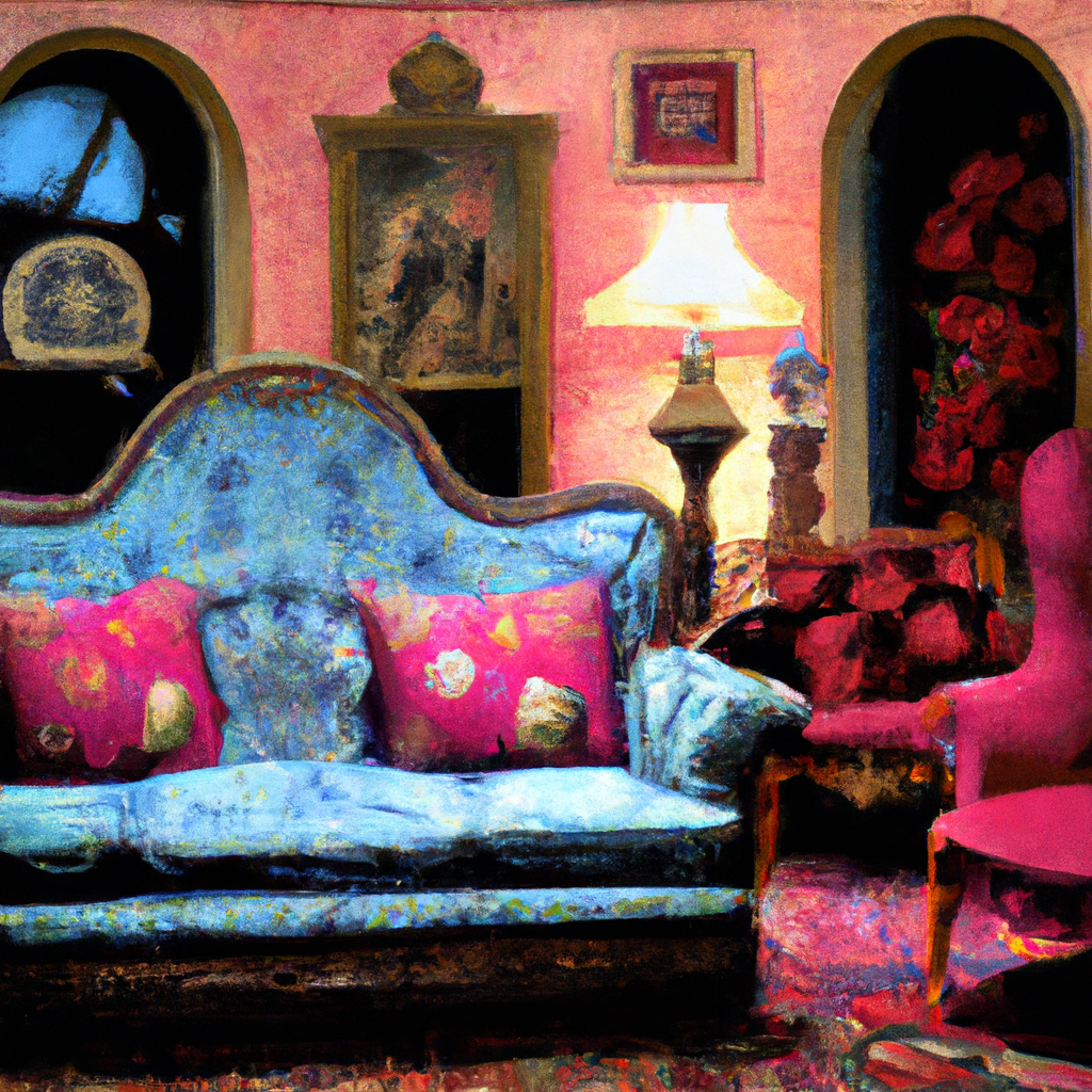
The Victorians loved colour in their interior design. Not just for beauty, but to show social class and status. Rich tones like burgundy, green, blue, and red were favoured by the wealthy. Middle class people preferred pale hues, like pastels. Patterns were also popular – floral prints and intricate designs on wallpaper or curtains.
Victorians were all about extravagance and grandeur. So, they mixed different patterns and colours in one room to impress guests and show off their wealth. Nowadays, this style might be too much. Homeowners can bring in Victorian design through accessories or paintings.
In Victorian times, dark colours were fashionable in winter. While light shades were in favour for summer. Jewellery inspired tones like emerald, ruby, sapphire, and amethyst were popular for festive season decor. While white candles and greenery brought a magical effect for winter celebrations.
If you want to stay subtle – paint walls light cream or beige. The ceiling off-white. Get ornate mirrors and vintage lighting fixtures like chandeliers. You can still tap into Victorian heritage without bold colors. Fun fact – they probably couldn’t even see the colours properly by candlelight!
Popular colors used in Victorian interior design
Popular hues of the Victorian period were bold, rich, and ornate. These included deep red, green, and blue. The design was a reflection of extravagance and opulence. Here are some color schemes popular in Queen Victoria’s homes:
- Dark green, burgundy, and navy blue on walls.
- Reds, maroons, golds, and creams for wallpapers and upholstery.
- Light pinks or pale blues with white or cream accents in nurseries and bedrooms.
Victorian-era interior design was unique for its focus on beauty. Decor like damask patterns or gold embellishments added grandeur to rooms. This gave a sense of sophistication and expressed personal style.
Don’t forget to add a touch of luxury to your home. Industrial standards and quaint craftsmanship styles have been preserved and come alive again. Incorporate these color schemes for a royal feel! Victorian interior designers were creating unique looks.
Color combinations and patterns in Victorian interior design
Victorian interior design is known for its unique colors and patterns. Earth tones, dark shades, and contrasting white or ivory were popular. Pastel hues such as light blue, pink, and pale yellow were used for wallpaper and furnishings. Floral designs, paisley patterns, stripes, and checks all featured. Metals like silver and gold added glamour.
Rectilinear shapes were big in furniture design, including chairs, beds, desks, and dining tables. Even mantelpieces incorporated geometric motifs. Nowadays, carpets have replaced hardwood floors.
To get that elegant Victorian style in today’s modern space, include vintage fixtures and ornate molding. Choose deep hues for a luxurious feel. Don’t let plain walls define your space– go for Victoriana!
Use of wallpaper and textiles in Victorian interior design
Victorian interior design was all about the details. Bold colours like burgundy, green and blue were used for wallpapers and textiles. Intricate floral and geometric designs were popular. Brocades, silks and velvet were used for drapery, upholstery and bedding. These patterns were often mixed and matched to create a cohesive yet interesting space. Tapestries depicting stories were used as decorative art pieces. They added texture to walls and conversation starters. Practical materials were used too, they could withstand heavy usage. Queen Victoria’s reign saw an increase in industrialization making these items more accessible. Luxury was expressed through gilded cupid statue on a velvet tufted armchair.
Accents and details in Victorian interior design
The interior design of the Victorian era was brimming with intricate details. Not only were these accents and embellishments visually pleasing, but they also showcased the homeowner’s exquisite taste. Rich colours, ornate fixtures, and vintage furniture blended together to create this era’s decor.
A table showcasing Victorian era interior design accentuates its unique qualities. These included deep greens, vibrant reds, blues, and golds – which conveyed wealth and richness. Chandeliers, stained glass windows, tapestries, and ceramic tiles were often used to create elaborate designs, seen in many Victorian Stately Homes today.
Scalloped edges were featured on chairs and tables, and intricate carvings were common on wooden furniture, such as armoires and dressers, adding antiquity to the room.
Most homes during this period were built with wood structures for economic reasons. Unfortunately, this sometimes led to sudden fires, sparking conversations about home safety. Victorian design can be modernized by adding an unexpected twist, like avocado to a classic BLT.
Contemporary reinterpretation of Victorian interior design colors and style
Bold colors and intricate patterns are essential in the modern representation of Victorian interior design. Opt for rich earth tones like burgundy, navy blue, and forest green, with gold accents on furniture and walls. To add a personal touch, incorporate floral motifs in fabrics or wallpapers. Crystal chandeliers or candlesticks will elevate the ambiance.
Striking a balance between ornate detail and simplicity is key. Layer velvet and silk on neutral tones to get an elegant aesthetic. Vintage mirrors and brass hardware are subtle nods to the Victorian era.
To bring everything together, strategically place lighter accessories such as plush pillows or statement wall art in royal hues like sapphire or ruby. These pops of color will make the room more inviting while maintaining an authentic Victorian style.
By incorporating these elements into your contemporary interpretation of Victorian interior design, you’ll create a cohesive atmosphere that reflects traditional and modern aesthetics, while preserving original design elements from the Victorian era.
Conclusion
Victorian era interior designs featured a range of colours – from dark to bright. These colours created a sense of luxury in the home. Decorative patterns and complex designs were commonplace.
One striking trend was combining deep greens with warm reds. Plush fabrics in pastel shades – like pale pinks, lavenders and blues – softened the impact of the design.
Colours differed by social class. Wealthy people had deeper shades like burgundy and navy. Less expensive colours included light yellows and greys.
Oriental style influences became popular too. Designs had Japanese-inspired motifs or Chinese lacquer details.
Victorian interiors were elegant and daring. They were lavish but still accessible. The use of colour allowed homeowners to show their personality in each room, while keeping sophistication. This is still relevant today.