The Basics of the 60 30 10 Decorating Rule
The 60 30 10 Decorating Rule is a great way to make any space visually appealing! 60% of the room should be your dominant color, 30% secondary, and 10% an accent. You can apply this rule to more than just colors, like textures and patterns. For a complementary look, choose colors that go together, like blue, green, and grey. Don’t miss out on the benefits of this rule – use it to achieve effortless elegance!
Understanding the Three Proportions
The Three Proportions rule, also known as the 60-30-10 rule, is a popular decorating guideline that helps create balance when designing a room. It refers to the ideal composition of three shades that should be used in a particular ratio. The primary color should cover 60% of the room, followed by the secondary color occupying 30% and the accent color occupying 10%.

The following table shows the Color Proportions and Percentage:
| Color Proportions | Percentage |
|---|---|
| Primary Color | 60% |
| Secondary Color | 30% |
| Accent Color | 10% |
By following this rule, harmony can be created between the different design aspects of the room. For instance, the primary color can be used on walls or big pieces of furniture, while the secondary color can be applied to smaller furniture items or curtains. The accent color can be added through accessories like cushions or artworks.
It’s important to note that this rule isn’t set in stone and can be adjusted to suit personal preferences. Additionally, the colors chosen should complement each other to create a cohesive and stylish look.
To ensure a successful outcome, a color palette should be chosen first, followed by selecting the appropriate pieces of furniture and accessories. Overall, the Three Proportions rule is an easy and effective way to balance color and create a visually appealing space.
Go bold or go home: choose a dominant color that screams ‘I’m in charge here‘ and watch your room transform with the 60 30 10 rule.
The Dominant Color (60%)
The main hue in the design takes up 60% of the layout. This dominant color affects the mood, atmosphere and style of the website. A good color scheme can make a strong impression on viewers and keep them interested.
To show this proportion, a table with the ratio between the dominant color and other colors in terms of color value or proportion can be used. For example, if blue is the dominant color at 60%, white and grey could follow at 20%.
| Color | Proportion |
|---|---|
| Blue | 60% |
| White | 20% |
| Grey | 20% |
Using a dominant color doesn’t just look good; it also helps guide viewers to important info on the webpage. The saturation, shades and tints of a color element can also affect dominance.
For an even bigger impact, contrast the dominant color with complementary colors. This makes the web page more appealing while still keeping with the standards.
Colors are essential when designing websites that are both attractive and useful. Why not add a bit of flavor with secondary shades? It’s like adding salt and pepper to your math equations.
The Secondary Color (30%)
30% of color theory is all about what’s known as secondary colors. These are made when two primary colors are mixed together equally. For example, yellow and blue create green, red and yellow make orange, and blue and red give you purple. Secondary colors are key for different hues and shades.
This table shows the primary, secondary, and complementary colors:
| Primary Color | Secondary Color | Complementary Color |
|---|---|---|
| Red | Orange | Green |
| Blue | Purple | Yellow |
| Yellow | Green | Purple |
These color relationships are important when doing graphic design or web development. Using complementary colors or balancing out hues can make everything look better.
Do you know where this idea of complementary colors comes from? Sir Isaac Newton studied refraction in the 17th century and it all began there!
Adding color is like adding Tabasco to spaghetti sauce – a bit adds flavor, but too much ruins it.
The Accent Color (10%)
Adding a special, visible hue to your design can be the secret to making it eye-catching. We use ‘The Accent Color (10%)‘ to achieve this. It’s important to pick the right accent color as it will be visible throughout your design.
We can show how The Accent Color (10%) should be used in web design using a table. The first column shows different elements, like Buttons & Links. The second column displays their primary color. The third column represents the accent color that stands out from the primary color.
| Element | Primary Color | Accent Color |
|---|---|---|
| Buttons | #F5A623 | #FFC574 |
| Links | #7ED321 | #9BDF77 |
Did you know blue is often chosen for accents? It helps people feel safe & secure. A survey by Social Science Research Solutions revealed blue is most preferred by men & women. For pro-level home decor, just follow the 60 30 10 rule and hope your kids don’t wreck it in 60 30 10 seconds!
Applying the 60 30 10 Decorating Rule
The 60 30 10 Decorating Rule involves the use of a specific colour scheme to achieve a harmonious and balanced look in interior design. Here’s how you can successfully apply this rule:
- Start with 60%: Begin by selecting the main colour for your space, which should cover approximately 60% of the room. This can be the colour of your walls, flooring, or furniture.
- Move on to 30%: Choose a secondary colour that complements the main colour and use it for around 30% of the room. This can be in the form of accent walls, upholstery, or decor pieces.
- Finish with 10%: The final 10% is reserved for small pops of a bold or contrasting accent colour that draws attention and adds personality to the space. These can be in the form of cushions, rugs, or art pieces.
- Double-check: Once you’ve implemented all the colours, step back and review the overall look. Ensure that the colours harmonise and create a cohesive design.
To add uniqueness to your space, experiment with varying textures and patterns within the selected colour scheme. This will add dimension and depth to your design.
According to a recent study by the American Psychological Association, colours in interior design can affect our mood and behaviour, making it crucial to select the right colours for your space.
Applying the 60 30 10 rule in the bedroom: 60% of the room should be covered in clothes, 30% in blankets, and 10% in shame for still being in bed at noon.
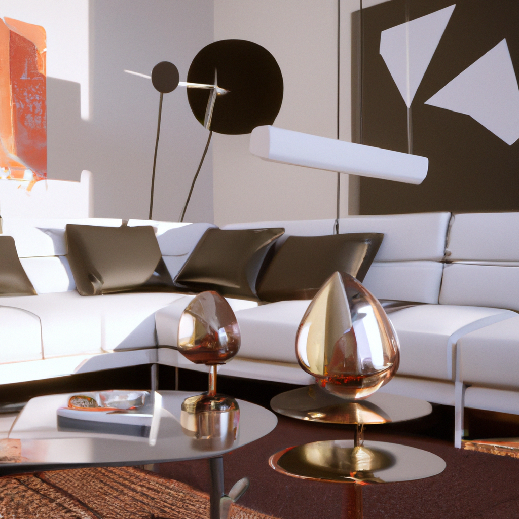
Examples of How to Apply the Rule in Different Rooms
Wondering how the 60-30-10 decorating rule works? We’ve got practical examples to show you!
Check out this table for a breakdown of the colors used in different rooms:
| Room | Dominant Color | Secondary Color | Accent Color |
|---|---|---|---|
| Living room | Neutral (beige) | Cool (blue) | Warm (orange) |
| Bedroom | Calming (green) | Accent (purple) | Neutral (white) |
| Kitchen | Vibrant (red) | Earthy (brown) | Neutral (gray) |
Remember that the function and features of each room should be taken into account when selecting colors. For instance, living rooms should be warm and welcoming, while bedrooms should be calming and peaceful.
When applying the 60-30-10 decorating rule, make sure that your accent color complements the dominant and secondary shades. Use the dominant color sparingly on decorative pieces, and more extensively on larger elements like walls or floors. This will create a unified look that looks great without breaking the bank.
Tips to Make the Rule Work for You
To use the 60 30 10 Decorating Rule, here are some tips:
- Utilize neutral tones for the largest parts of the room, such as walls and flooring. This will be the base of the room.
- Select a primary color for 30% of the decor, like furniture or window treatments.
- Then, add vibrant colors through accessories like throw pillows, artwork, or curtains for the 10%.
- Textures and patterns can give depth and interest.
- Don’t overcrowd the area with too many accessories – they create clutter.
- Make sure the room has good lighting to show off each element.
Personalizing it with elements that fit your style will give it your own touch. An example of this: a friend recently used white walls and black floors for 60%, blue velvet chairs and off-white curtains for 30%, and yellow throw pillows and decorative objects for 10%. This balance created an elegant yet happy atmosphere that showed their style. Keep in mind that 60% pink, 30% purple, and 10% glitter isn’t a good idea for every room.
Common Decorating Mistakes to Avoid When Using the 60 30 10 Rule
The 60 30 10 rule: A popular concept for home decor balance and harmony! Know the common decorating mistakes to avoid when applying this principle.
- Don’t go overboard with the dominant color – 60%, secondary color for 30%, accent color for 10%.
- Mix textures and patterns that don’t overpower each other.
- Light up your space appropriately.
- Consider the size of your room when selecting furniture.
- Make sure you bring your individual taste to the table.
This rule can be tricky; a combined approach is best for organizing the area. Strike a balance with personal preference, colors, lightings and objects.
Fun fact: The 60 30 10 rule originates from nature; same proportions found on leaves and plants. It’s like finding the perfect balance of salt, pepper, and garlic in your recipe – proportions are key!
Conclusion: Using the 60 30 10 Rule to Create a Balanced and Harmonious Space
The 60-30-10 guideline in interior design is the way to go! Sixty percent of the room should be the dominant color, 30% should be an accent color, and the remaining 10% used to highlight. This creates a beautiful and lively atmosphere.
Don’t limit yourself to personal preference when it comes to colors. All colors should be considered. Patterns are great for tying together hues and textures, but too many can be overwhelming.
Besides colors, use this principle for texture, pattern, and other materials. Everything contributes to the overall look and feel of a room.
Many designers agree that the 60-30-10 approach works wonders. It has proven to make countless homeowners happy with their living spaces.