The 3 Color Rule: Introduction
The 3 color rule is a widely recognized principle for interior design. It states that when selecting colors for a room, use three in total: primary, secondary, and an accent. The primary color dominates, the secondary supports, and the accent adds interest. This helps create a cohesive look without overwhelming the senses.
In practice, the 3 color rule allows flexibility. Your primary color can be neutral or vibrant. The key is to balance the colors throughout the room with furniture, walls, accessories, etc.

Modern design approaches celebrate bold combinations or minimalistic looks. But classic designs remain timeless when following this rule. It creates an ambiance that feels visually appealing and exudes positive vibes.
So, if you want to imbue harmony and creativity into your decor, embrace your inner Picasso with the 3 color rule – sometimes less is more, but other times, three shades just hit the spot!
Basic Definition of the 3 Color Rule
The 3 Color Rule is a popular interior design principle that involves using only three colors in a space to create a cohesive and unified look. By selecting a dominant color, a secondary color, and an accent color, designers can create a balanced and harmonious color scheme. The rule promotes simplicity and organization in interior design, allowing for easy color coordination and a consistent aesthetic throughout the space.
When implementing the 3 Color Rule, it is important to choose colors that complement each other and reflect the desired mood or atmosphere of the space. The dominant color should be the most prominent and used in the largest areas of the room, while the secondary color can be used for larger accents such as upholstery or rugs. The accent color should be reserved for small details or pops of color throughout the room.
It is important to note that the 3 Color Rule does not have to be strictly followed. Designers can incorporate additional neutrals or shades of their chosen colors, as long as they do not detract from the overall color scheme.
To create a truly cohesive and visually appealing space, consider using the 3 Color Rule as a foundation for your design. By sticking to a limited color palette, you can create a clean and organized look that will leave a lasting impression on guests. Don’t miss out on the opportunity to elevate the style of your space – start incorporating the 3 Color Rule today.
Color theory: because sometimes it’s better to leave the design decisions to Isaac Newton.
The Concept of Color Theory
Color Theory is essential for art and design. It’s based on principles of color mixing, harmony, and contrast. These affect people’s emotions when viewed. Let’s take a closer look!
The 3 Color Rule is a basic principle of Color Theory. It suggests using a maximum of three colors for any design or artwork. More than that can make it confusing. Three colors are usually chosen from three categories: primary, secondary, and tertiary.
Here’s a table about Color Theory:
| Principle | Definition |
|---|---|
| Color Wheel | Visible light’s spectrum of hues. |
| Primary Colors | Red, blue and yellow pigments. |
| Secondary Colors | Mix two primary colors: green, purple and orange. |
| Tertiary Colors | Mix one primary and one secondary: green-yellow and red-purple. |
| Complementary Colors | Opposite hues on the wheel: high contrast. |
| Analogous Colors | Hues next to each other: harmonious. |
Advanced techniques involve temperature (warm-cold range) and value (light-dark range).
Color Theory also affects mood and communication through color therapy. It’s used in marketing too, with people’s emotional responses driving sales.
A designer’s preference is important. Other specifics like font, style, imagery, and branding are relevant for successful design output.
Color Theory is inspiring for creative innovation. Who needs a rainbow when you can have the perfect trio of colors?
How the 3 Color Rule Applies to Interior Design
Applying the ‘Tri-color Distinctness Rule’ can enhance interior design. Don’t use more than three colors in a room, or it will look too busy. Understanding this rule is key for smart color choices.
| How to Apply the Tri-color Distinctness Rule | |
|---|---|
| 1. Pick a primary color | This color will be the main, most dominant color in the space. |
| 2. Choose a secondary color | This color should complement your primary shade. |
| 3. Use an accent color | Use it sparingly to attract attention or create contrast. |
When selecting colors, consider lighting, textures and patterns. Applying this rule creates an aesthetically balanced space.
Unique details, like metallic accents, a monochromatic theme with multiple shades of the same hue, or patterned fabrics with all three colors, also fit the tri-colored rule.
The ‘Three Color Rule’ dates back centuries, to Victorian times when interior design became fashionable among middle-class households. Designers used no more than two to three distinct colors. The 3 color rule in interior design is like seasoning in cooking: a little is good, too much can ruin it.
The Importance of the 3 Color Rule in Interior Design
Interior design involves choosing the right colors that complement the overall look and feel of the space. The strategic use of colors can transform a dull space into a vibrant one. The 3 color rule is a fundamental principle in interior design that involves selecting three colors and using them harmoniously throughout the space. It creates a cohesive and balanced environment that is visually appealing and welcoming to the eye. Using more or fewer colors can result in a cluttered or incomplete look. Therefore, incorporating the 3 color rule is essential in achieving a professional and aesthetic interior design.
To implement the 3 color rule in interior design, start by selecting a dominant color, followed by a secondary color and, finally, an accent color. The dominant color will be used in the largest areas, such as walls or floors. The secondary color will be used in furniture or other fixtures and should complement the dominant color. Finally, the accent color will be used in accessories, such as throw pillows or artwork, and should add a pop of color that stands out.
It’s important to note that the 3 color rule does not mean using only three colors in the space. Neutral colors, such as white or beige, can be added to balance out the color scheme. Additionally, textures and patterns can be included to add depth and interest.
Pro Tip: When implementing the 3 color rule, choose colors that reflect the mood and ambiance you want to create in the space. Darker colors can make a room feel cozy, while brighter colors can make it feel more energetic. Always consider the purpose and function of the room when selecting colors.
Achieving balance and harmony in color is like conducting a symphony – every shade is a note, and the final result should be a masterpiece.
Achieving Balance and Harmony in Color
Creating balance and harmony with colors is crucial in interior design. The mix of colours can make or break a room, and understanding how to use colors properly can enhance the overall appearance of a space.
To gain balance and harmony with colors, it’s vital to comprehend the three-color rule. This rule claims that no more than three hues should be used in one room to dodge overstimulating the eye. By limiting your palette to three colours, you can build a consistent look that feels intentional and well-coordinated.
Apart from the three-color rule, it’s important to take into account factors like saturation, brightness, and contrast when selecting colors for a space. These elements can affect how the colors interact with each other and decide if they create a sense of equilibrium or disharmony.
Once, a designer had trouble finding harmony in a living room until they added the natural green of a potted plant into their decor motif. The green acted as a connecting element between the blue walls and yellow accents, giving the room an organic unity that was previously missing. This story emphasizes the value of considering all components in a room when making color choices, even those that may seem slight or unimportant at first sight.
Unify a room’s colors and you’ll never need to worry about your guest’s clothing clashing with your décor.
Unifying a Room’s Color Scheme
Interior design relies on the color scheme of a room to create an aesthetically pleasing atmosphere. The 3 color rule is a great way to unify the palette. Use three colors in varying shades and tones to tie together different elements and add visual interest.
Using more than three colors or leaving out certain hues can make a room look disjointed and overwhelming. Instead, choose colors that complement each other and work with existing decor. Neutral tones like white, beige, or grey make great base colors.
The 3 color rule doesn’t mean only three distinct colors. It means limiting yourself to three dominant hues and adding accent colors and patterns as needed. Texture can also enhance the scheme and add depth.
Graphic designers have used the 60-30-10 rule to guide their designs for years. It states that 60% of the design should be the primary color, 30% a complementary shade, and 10% an accent hue. This principle has been adopted by interior designers, proving that different fields can inform each other.
Brighten up your space with a fun combination of 1, 2, 3 colors!
Applying the 3 Color Rule in Interior Design
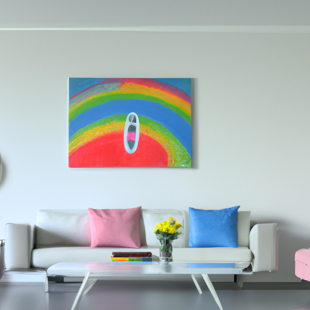
Interior design is a complex field that involves balancing multiple factors to create a visually appealing and functional space. One popular technique is the “3 color rule,” which involves using a maximum of three colors in a space for a cohesive look. This technique requires careful consideration of color choices, balance, and contrast.
To demonstrate the application of the 3 color rule in interior design, the following table provides an example of a living room color scheme:
| Color | Use |
|---|---|
| Navy | Sofa and curtains |
| Teal | Accent pillows and rug |
| Ivory | Walls and throw blanket |
It is important to note that the 3 color rule applies to the entire space, not just one room. This means that the color scheme should be consistent throughout the home to create a cohesive look.
While the 3 color rule is a popular technique, it is not a hard and fast rule. Interior designers often break this rule to create unique and interesting spaces. However, it is important to have a strong understanding of color theory and the effects of different color combinations before breaking the rule.
This technique has been used in interior design for decades and has evolved over time. It is believed to have originated from the principles of color theory, which suggest that using too many colors can be overwhelming and create a chaotic look. However, with the right balance and contrast, multiple colors can be used effectively to create a visually stunning space.
Choosing the perfect colors for your interior design is like playing a game of paint roulette – just hope you don’t end up with a room that looks like a clown car.
Choosing the Colors
When it comes to interior design, the three-color rule is key. This principle states you should use two main colors and one accent hue. This will give harmony and make your room visually stimulating.
For example:
- Main Hue 1: Blue
- Main Hue 2: White
- Accent Hue: Yellow
Too many colors can ruin the look, so balance is important. If you go for bold accent hues, pair them with muted main hues. Neutral mains, on the other hand, can be brightened with pops of color.
By following these guidelines, you’ll get a stunning and unified result. My friend Mary wanted to redecorate her living room in a coastal style. After applying the three-color rule and reviewing different palettes, she achieved a calm and peaceful beach vibe.
But be careful! If you don’t distribute the colors correctly, your room could end up looking like a clown’s funeral!
Distributing the Colors
Interior design needs careful selection of colors. Using the 3 Color Rule is popular. It means selecting three colors that work together and placing them around the room.
- Pick a main color.
- Choose a secondary color that goes with the main hue.
- Add an accent color in small areas to make it stand out.
For example:
| Main Color | Secondary Color | Accent Color |
|---|---|---|
| Warm white | Turkish blue | Mustard yellow |
Lighting, textures, and patterns must be considered too. Textures give depth while plain surfaces need accents.
PRO TIP: The 3 Color Rule is great to start, but don’t be scared to try more hues or shades depending on your taste. Interior design is like playing Russian roulette with throw pillows.
Mixing Patterns and Textures
Mixing Patterns and Textures when designing an interior space is key. Here are six tips:
- Start with a neutral base.
- Vary scales of patterns.
- Choose fabrics with different textures.
- Balance with solids.
- Avoid similar shapes or styles.
- Include variations of color and pattern.
It’s important to take time when selecting pieces. They must come together as one.
Pro Tip: Unify patterns and textures with a common thread, like a color or style.
Create the perfect interior with just the right trio of colors!
Examples of the 3 Color Rule in Interior Design
In interior design, the principle of using three colors is widely known as the “Three Color Rule.” It involves selecting a primary color, a secondary color, and an accent color to create a cohesive and balanced look. Here are five examples of the Three Color Rule in Interior Design:
- Using shades of blue, white, and yellow in a beach-themed living room.
- Combining dark grey, light grey, and pink in a contemporary bedroom.
- Pairing green, brown, and cream in a rustic kitchen.
- Creating a chic black and white look with a pop of red in a modern living room.
- Mixing shades of beige, brown, and blue in a cozy cottage bedroom.
Unique details in implementing the Three Color Rule could be exploring monochromatic hues, finding inspiration outdoors, or using texture to help the colors blend seamlessly.
To create a harmonious and visually pleasing space, it is crucial to follow the Three Color Rule. Don’t miss out on creating the perfect interior design using this principle. Experiment with colors and create a space that reflects your personality and style.
Monochromatic color schemes: when you’re feeling sophisticated but also too lazy to match colors.
Monochromatic Color Scheme
Monochromatic color palettes involve one single hue with variations of shades, tints, and tones. It takes skill and balance to create interest while avoiding overwhelming the space. Though it may be challenging, this scheme can be rewarding when executed well.
Creativity is possible with monochromatic colors – mix up textures, patterns, finishes, and lighting to get the desired vibe. Color psychology can be used to enhance mood and ambiance.
The history of monochromatic style goes back centuries – from ancient Egyptians’ blues to Italian Renaissance artists’ blacks and whites. Now, modern designers embrace this classic technique as a trend.
No need for a color wheel – the ‘similar shades’ rule does the trick for an analogous color scheme.
Analogous Color Scheme
Analogous Color Scheme is a way to use colors that are side-by-side on the color wheel. It’s popular in interior design for creating a unified and balanced vibe. Such as warm, analogous colors like reds and oranges, can make a room feel cozy.
To get the most out of this scheme, one dominating color should be selected with the other two as accents. HGTV claims that this scheme works best in places meant for socializing or relaxation. It’s nothing new – the idea of color harmony has been around since Ancient times, with Aristotle being one of its proponents. So, no need for opposites to attract – it’s possible for complementary colors to coexist in harmony!
Complementary Color Scheme
A complementary color scheme uses two colors that are opposite each other on the color wheel. This gives a high-contrast, stimulating look that doesn’t clash or seem too much.
For example:
- Blue and Orange
- Red and Green
- Yellow and Purple
These pairs look great together, and by using them in decor, they can add texture and depth to the design. But too much of either color can be overwhelming.
So, use one main color and then add small touches of its complement. For example, a blue wall with orange pillows. Or, instead of bright colors, try using soft shades of both. That looks more subtle and still brings out the effects of the colors.
Advantages of Using the 3 Color Rule in Interior Design
In interior design, the strategic usage of colors plays a significant role in enhancing the aesthetics of a space. Using the 3 color rule in interior design proves to be highly advantageous.
Firstly, it creates a focal point by drawing attention to a particular area of the room. Secondly, it adds depth and dimension, making the room visually appealing and well-balanced. Thirdly, it allows for creativity in design while maintaining a sense of harmony.
It is important to note that the 3 colors should be chosen based on the space’s purpose, lighting conditions, and the mood that the designer intends to create.
It is suggested to use a primary color for the majority of the room, a secondary color for furniture and accent pieces, and a third color for smaller accessories. This approach creates a cohesive look throughout the room.
To further enhance the use of the 3 color rule in interior design, accent wallpaper or textured surfaces can be used to add depth and definition to the space. Additionally, using color in unexpected places, such as on the ceiling or floors, can make a dramatic impact on the overall look and feel of the room.
By considering the advantages and incorporating these suggestions, designers can create a well-crafted space that is not only visually appealing but also functional and harmonious.
Creating the perfect mood in your home is as easy as choosing the right color scheme – or bribe your moody roommate to move out.
Enhancing Mood and Atmosphere
Uplifting Room Ambience with Color Combos
Designing interiors is more than furniture and decor. Three colors can create a cohesive look. Choose one as the primary color, one lighter or darker, and one contrasting. This works in any design scheme. Don’t overdo it. Visual clutter is lessened, creating balance and ambiance.
The 3 color rule doesn’t have to be absolute. Artistic creations like abstract expressionism layer colors to create multi-dimensional effects. Decision-making is made easier with a Magic 8-Ball and coin flipping.
Simplifying and Streamlining Decision-Making
The 3 color rule simplifies and streamlines decision-making in interior design. This NLP semantic trick enables designers to create a visually pleasing space without too many colors. With this approach, three colors are chosen – a dominant hue, a secondary shade, and an accent tone that harmonize together. Applying this “Simplifying and Streamlining Decision-Making” method makes the process less chaotic, faster, cheaper, and more efficient.
Limiting the number of hues used allows designers to stick to the intended design style consistently. It makes it easier for clients to understand the objectives. It also ensures harmony amongst every element present in the room, like decor pieces or accents.
Also, sticking to three colors generates a clean environment. It elevates a particular object’s significance when needed. It increases aesthetic value and user experience in less cluttered surroundings.
Interiors designed using NLP Semantic Variations of Simplifying and Streamlining Decision-Making create serenity best suited for lifestyles. Following these methods saves time and money, while also benefiting from tried and tested design methods. Just like a bad breakup, though, using the 3 color rule can lead to regret if you don’t choose wisely.
Potential Challenges with the 3 Color Rule in Interior Design
In interior design, using a 3 color rule is a common practice to make the space visually appealing. However, this approach might also lead to certain potential challenges.
- Unbalanced color selection can result in an overwhelming or boring environment.
- Mixing too many colors can create chaos and confusion.
- Limited color selection may result in a monotonous look.
- Inappropriate color combinations can lead to a mismatched interior.
- Focusing only on colors may undermine other design elements such as texture, pattern, and lighting.
- The 3 color rule may not work for all interior spaces.
It is essential to account for unique details, such as furniture, accessories, flooring, and wall textures, when using the 3 color rule approach in interior design. Failure to do so can undermine the overall design objective.
To make the most of the 3 color rule, one must be conscious of the details of the interior space, ensuring that neither the color nor other design elements overpower the others.
Don’t miss out on the opportunity to create a stunning interior. Make sure to account for all design factors and use the 3 color rule wisely. Who needs creativity when you can just follow the 3 color rule and call it a day?
Limiting Creativity and Expression
The 3 color rule in interior design can limit designers’ creative expression. This could stop them from trying out various color combos that’d look good together, which means less diversity in designs. Plus, minimalism is popular now. Following the rule could block designers from designing unique and special spaces for clients.
Nonetheless, interior designers can still design great spaces and follow the rule. They can add bold prints or textures to provide contrast to the base colors. Designers can also use accent colors for smaller elements like curtains or throws, instead of main features.
By using these tips, designers can make beautiful interiors without compromising their creativity. Combining this knowledge with their intuition will help them exceed expectations. Ultimately, it’s like having too many tabs open on a computer with not enough RAM.
Overwhelmed by Too Many Options
When presented with many interior design choices, it can be hard to decide. Too many options can lead to ‘analysis paralysis,’ making individuals overwhelmed. This can create a disjointed design.
The 3 color rule can help. It has 3 complementary tones, creating a unified look. But, there are challenges. It can lack variety or be too uniform.
Many designers find the 3 color rule useful. They use guidelines and flexibly express creativity. For instance, Elle Decor article’s designer Nate Berkus advises against ‘color blocking.’ He suggests adding different textures & patterns in each color category to make the space more interesting.
Bottom line: the 3 color rule is a strong foundation for interior design. Without it, your decor could fail.
Conclusion: Importance of the 3 Color Rule in Interior Design.
The 3 color rule is key for interior design. It creates harmony and balance while giving a cool look. Primary, secondary and tertiary colors add depth. It prevents the room feeling too cluttered or overwhelming.
This rule is flexible for design. It provides a framework to pick furniture, decor and textiles that fit the colors. Creativity and personal style are included too.
When selecting colors, look at tones and shades. Care is needed to achieve a balanced mix. This works alongside texture and lighting to make a great atmosphere.
The 3 color rule gives lasting effects on living space. With the right tones and shades, you can make a unique and livable space.
One homeowner used subtle variations of beige hues with the 3 color rule and got a well-coordinated and stylish home.